January 24, 2008, 12:36 AM
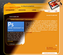 I had been thinking about it for a long time and I finally decided to do it : a brand new blog (or rather which looks like it). As soon as I had made the former version I thought it looked outdated, simplistic, and I was fed up of orange. Now everything’s good, and I hope you will like it too.
Posted in Others
December 23, 2007, 6:39 PM
 As I’m a bit pissed off not to have any of my most recent work on my online book, for confidentiality reasons, I decided to create a Happy New Year animation for this website, similar to one I recently made for my work. And to stay in this blog’s “guidelines” I explain how it’s made. You have certainly seen that on the internet, on the biggest portals, advertisement has changed. You now find transparent flash animations which push boundaries, jumping out of the frame which is normally dedicated to them and covering the whole page, which you can still see behind them, for a few seconds. Some people will be annoyed by them, as they already are pissed off against advertisement which they would like to get rid of. But graphically speaking, I find it very interesting to be able to jump out of the frame in such a way.
Since Flash 8, it is possible to add videos with an alpha (transparent) layer on a website. It is not used much and doubles the weight of these videos, it requires you to have a recent flash version, and it takes a lot of computing power from your computer. But you can that way get some nice effects with software such as After Effects, which you cannot create in Flash, even though since its eighth version it has brought up a lot of new features (blur, blending modes, halo, shadow…). The banner you see on this website (if you have Flash 8) is made that way. Hover over it with your mouse pointer in order to see more…
I hope you will like it. Happy New Year 2008 !
Briac Pollier
Note: considering the time of year I have deleted this banner
Posted in Others
September 12, 2007, 9:16 AM
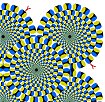 I love movement, that’s what I consider to be the most interesting part in graphic design. But I was really surprised to discover that you could get movement through a single completely still image… At least that’s the way the brain interprets it. That’s the work of a certain dr. Akiyoshi Kitaoka, who even though he works with images in a domain explored by some artists, such as the very famous Escher, doesn’t consider himself as one but as a scientist. Be careful his work can make you dizzy, because it goes against all logic, epileptics especially should not visit his website. That’s what he writes on his homepage : “Should you feel dizzy, you had better leave this page immediately”
Variations on the rotating snakes thematic
His personal website, with a lot of other creations
Posted in Interesting websites
September 5, 2007, 8:14 PM
 I’m not really part of the target audience (Women, older than me, with a driver’s license) but the Peugeot 1007 TV advertisements having raised curiosity in me, as it was clearly pointing towards a website which could only have been developed with a big amount of money, I went to see what it was about. It’s not an incredible website, it’s quite simplistic, and makes me think of a rally game from year 2000. But it’s rich media, and the videos are well made and well integrated to the page. I have always liked this mix of technologies which is more and more common.
Peugeot 1007’s website
Posted in Beautiful websites
September 1, 2007, 10:20 AM
 It’s always nice to discover a company which gives major importance to its communication over the internet, so much they are ready to take some risks, with a website which doesn’t look as common as all the others, but rather with creative content, close to art. That’s in my opinion the case for “Le coq sportif”, famous brand which manages to make its image look younger and more dynamic. Whether you like sports or not, I think it’s difficult to be indifferent in front of their websites, which all have a very different kind of look and feel. They have something for every taste.
Le coq sportif
Posted in Beautiful websites
August 29, 2007, 4:26 PM
 Another article in the “website verification” series right after another one on the subject. Especially as I hadn’t updated my blog for some time ( I was spending a lot of energy and time creating a new look and feel for my website – Don’t hesitate to go and see it to tell me what you think about it ).
Web browsers change the behavior of web pages, but the way they show up also depends on what is activated or not (or even installed). Some people deactivate javascript to prevent spywares, making some websites such as this blog unusable, but it’s easy to do some tests, especially with Mozilla where javascript deactivation is easy to find (Tools > Options > Content). But that’s something you cannot do with Flash, once installed the only way I know of would be to uninstall it every time to test how your website looks without it, and how Flash detection scripts behave. That’s something nobody would do. Fortunately there is a free utility (for PCs) which enables you to deactivate Flash temporarily, to see how the page shows up on a browser without Flash installed. It’s called TurnFlash. Unfortunately it only works with Internet Explorer, but that’s good enough.
Download TurnFlash
Posted in Free
, 3:55 PM
![]() This post is mainly for people like me who create webpages. Creating a website is much harder than it seems when you don’t know any of the technical stuff, aesthetics are one thing but you need to make sure everybody sees the same thing, if the pages are made in html and not flash. Therefore you need many web browsers on your computer, and if you have more than one computer it can be useful to keep outdated versions of the browsers just for test purposes. But unless you own a Mac, even when you do that you don’t take into account a part of the visitors, the ten percent who use Safari. I hate Safari. When I was working on a Mac I was using Mozilla. Therefore I’m not advertising for this software, but it can be very useful for test reasons. The thing is, nowadays, even though you cannot download an older version of that browser, you should know that Safari 3 just came out for PCs. Funny to see that they even the Mac interface for their Safari Windows port, it looks exactly the same as on a Mac system (but luckily without the biggest shortcoming of Mac browsers: there is a button to maximize your window, as with any other Windows application). Safari 3 download
This post is mainly for people like me who create webpages. Creating a website is much harder than it seems when you don’t know any of the technical stuff, aesthetics are one thing but you need to make sure everybody sees the same thing, if the pages are made in html and not flash. Therefore you need many web browsers on your computer, and if you have more than one computer it can be useful to keep outdated versions of the browsers just for test purposes. But unless you own a Mac, even when you do that you don’t take into account a part of the visitors, the ten percent who use Safari. I hate Safari. When I was working on a Mac I was using Mozilla. Therefore I’m not advertising for this software, but it can be very useful for test reasons. The thing is, nowadays, even though you cannot download an older version of that browser, you should know that Safari 3 just came out for PCs. Funny to see that they even the Mac interface for their Safari Windows port, it looks exactly the same as on a Mac system (but luckily without the biggest shortcoming of Mac browsers: there is a button to maximize your window, as with any other Windows application). Safari 3 download
Posted in Free
August 20, 2007, 4:45 AM
 “Au secours j’ai un blog” (Help! I’ve got a blog – sorry it’s a French blog and the English quality is not very good as it’s a Google translation) is a website about graphic design which deserves to be visited. Unlike mine its is not about the technological aspect of graphic design, but about the actual creations, in every media field. Those who like magazines such as Pixel (French graphic design magazine) should find things they like in it. It’s nice to see a graphic design blog with graphic content which is not that of its creator, especially when the selection is made, in my opinion, with taste.
Au secours j’ai un blog!!
Posted in Interesting websites
August 19, 2007, 5:57 AM
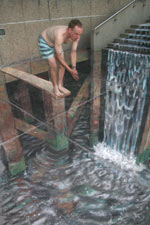 I’ve discovered this artist’s work randomly while I was surfing the web, and I find it worth knowing. It’s a sad thing that his website is not up to par with the quality of his work. Living with his era, he doesn’t paint on a canvas but on the pavement, and where it becomes interesting is when it plays with your senses, making you believe that the two dimensional floor actually has a depth to it. It’s sad I’ve never seen his paintings in real life, but the pictures are impressive. Of course for this kind of work pictures enable the perfect spot for the illusion, as in reality with a bad angle the illusion would be broken. Still, in our day and time, when people want get rid of any notion of beauty in art creation, where rebellious movements thirsty of breaking a way too strict academicism have become academicism themselves without event being aware of it, as that’s the kind of Art you learn in Fine Arts schools, as in our day and time there is a dictatorship of ready-mades and happenings, this kind of creation, interacting directly with the spectator’s emotions, is what in my opinion is real art.
Julian Beever’s website
Posted in Artists
, 4:48 AM
 After a busy week, between freelance work and search for employment, I haven’t been able to post anything here. I make use of the week-end to do that.
Internet revolutionizes habits. Not only is it a full-fledged communications tool, but it also tends to become the new way of doing things traditionally intended for other medias. You could think about low-cost video advertisement especially prepared for the internet, using Youtube and its likes. You could think as internet based animation, thanks to Flash, such as Happy Tree Friends, which I have already written about. But another type of creation is interested by internet: comics. Sure you cannot earn any money that way (or maybe you can through advertisement if you have enough visitors for that?) but it enables you to become known, without having to go through a publisher, which can prove itself to be extremely selective. If the quality of the content is good, the writer gets encouragement from the readers who come and see his work, and then with a lot work already done and an already existing audience, publishing companies are not out of reach anymore. Therefore a lot of people are launching their webcomic, and amongst them you can discover some jewels. One of these is Maliki’s webcomic. Well drawn (if you like maga style that is), short and funny stories.
The website itself deserves being seen: much more than a blog, you will notice the animated character whose colours you can change, the different sections, one of which enables you to use Maliki as a doll, a bit like the Simpsons movie avatar creation section I’ve already written about.
Maliki’s webcomic
Posted in Free


