May 26, 2013, 12:31 PM
Catégorie : Beautiful websites
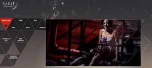
 That’s a very different field than the previous post, that of the video game industry, however the kind of campaign is similar. And not for just any game, one of the best ever in my opinion, Deus Ex Human Revolution.
For that game the marketing team made a “mini” website, the Sarif industries website. Of course that company doesn’t actually exist, it is part of the game’s plot, a company specialized in cybernetic implants for which the hero is chief of security, and is going to start asking himself questions, first about his employer, then about the whole system, the whole world, figuring out the democracy he believes he is living in is not as democratic as one might think, especially because the medias are under a very strong control… Not only that website is the homepage of a fictional company, but which seems to be a real one, showing the different devices they sell and their advantages, news extracts, etc. just like a real corporate website would, but it is also placed into the game’s context, where an anti implants activists group, which apparently seem to be against cybernetic implants for ethical reasons, is at war against them. That website therefore looks as if it had been hacked by that activists group, and navigation is malfunctioning, but that’s done on purpose, (more…)
Posted in Beautiful websites, Interesting websites
September 5, 2007, 8:14 PM
 I’m not really part of the target audience (Women, older than me, with a driver’s license) but the Peugeot 1007 TV advertisements having raised curiosity in me, as it was clearly pointing towards a website which could only have been developed with a big amount of money, I went to see what it was about. It’s not an incredible website, it’s quite simplistic, and makes me think of a rally game from year 2000. But it’s rich media, and the videos are well made and well integrated to the page. I have always liked this mix of technologies which is more and more common.
Peugeot 1007’s website
Posted in Beautiful websites
September 1, 2007, 10:20 AM
 It’s always nice to discover a company which gives major importance to its communication over the internet, so much they are ready to take some risks, with a website which doesn’t look as common as all the others, but rather with creative content, close to art. That’s in my opinion the case for “Le coq sportif”, famous brand which manages to make its image look younger and more dynamic. Whether you like sports or not, I think it’s difficult to be indifferent in front of their websites, which all have a very different kind of look and feel. They have something for every taste.
Le coq sportif
Posted in Beautiful websites
August 4, 2007, 1:54 AM
 If you are a web designer, you know what CSS styles are. You are most certainly using them. They are progressively replacing tables, even though might sometimes be even more complicated to use. Sometimes they can create a real challenge where tables gave you a simple solution, for things such as vertical centering. They are not the most compatible system, showing differences between Mozilla and IE if they are not well created, and they’re close to unusable for e-mailings as email clients prefer very old style html.
But you cannot avoid them, as they enable you to have a cleaner encoding, are used in CMS, enable you to change the graphical aspecrt of a whole website just by changing a file and, more importantly, enable getting read of unnecessary information on the webpages themselves by removing references to colour and layout on them.
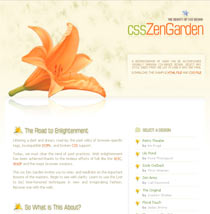
It can be hard to realize how much flexibility they enable. That’s why a website is dedicated to them, a “proof of concept” website where one simple page est is declined under a huge amount of CSS styles, very different from each other.
CSS Zen Garden ( To see the different “layouts” chose one in the right hand menu )
Posted in Beautiful websites
July 20, 2007, 5:15 AM
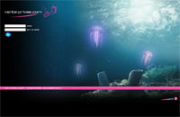
 A small article on private sales, not because I’ve been a graphic designer during three months for the second biggest website in this sector in France but because it’s an important internet phenomenon over the internet specifically in my country, they are the most beautiful e-commerce websites, and everybody doesn’t know about them. Private, or flash sales, is a French phenomenon which was launched by the leader vente-privee.com. It’s an online store accessible only to the people who have subscribed to the website, with famous brands for a determined period. Sales are announced through newsletters linking to beautiful motion design animations advertising on the brand which is going to be sold at that point, the kind of products you will find, and the dates. When that time lapse is finished everything (or nearly everything) which was being sold is sold, buyers feeling somewhat privileged. That’s because the stocks are small but for a specific time-lapse, thus enabling very attractive prices on products which generally can be very expensive. They generally sell clothes, but the leader recently surprised everybody by selling… cars. And they sold all of their stock! Leader who considers it has enough clients to stop accepting subscriptions to its website, unless you are “introduced” by another user. Yet another way of giving the impression of being privileged. With that objective in mind, all of the graphic design is top of range, whether it’s the motion design of the announcements or the websites themselves. Just look at vente-privee.com’s homepage to get an idea, especially keeping in mind they change it every month… A lot of this companies are opening branches abroad at this time. Some of these websites: vente-privee.com, the leader. AchatVIP.com, the second biggest. Fruitrouge.com: not one of the leaders yet but they have put a special attention to aesthetics.
Posted in Beautiful websites


